HACKNEY REPORT
Editorial | Print Design - Shillington London Student Brief

THE BRIEF
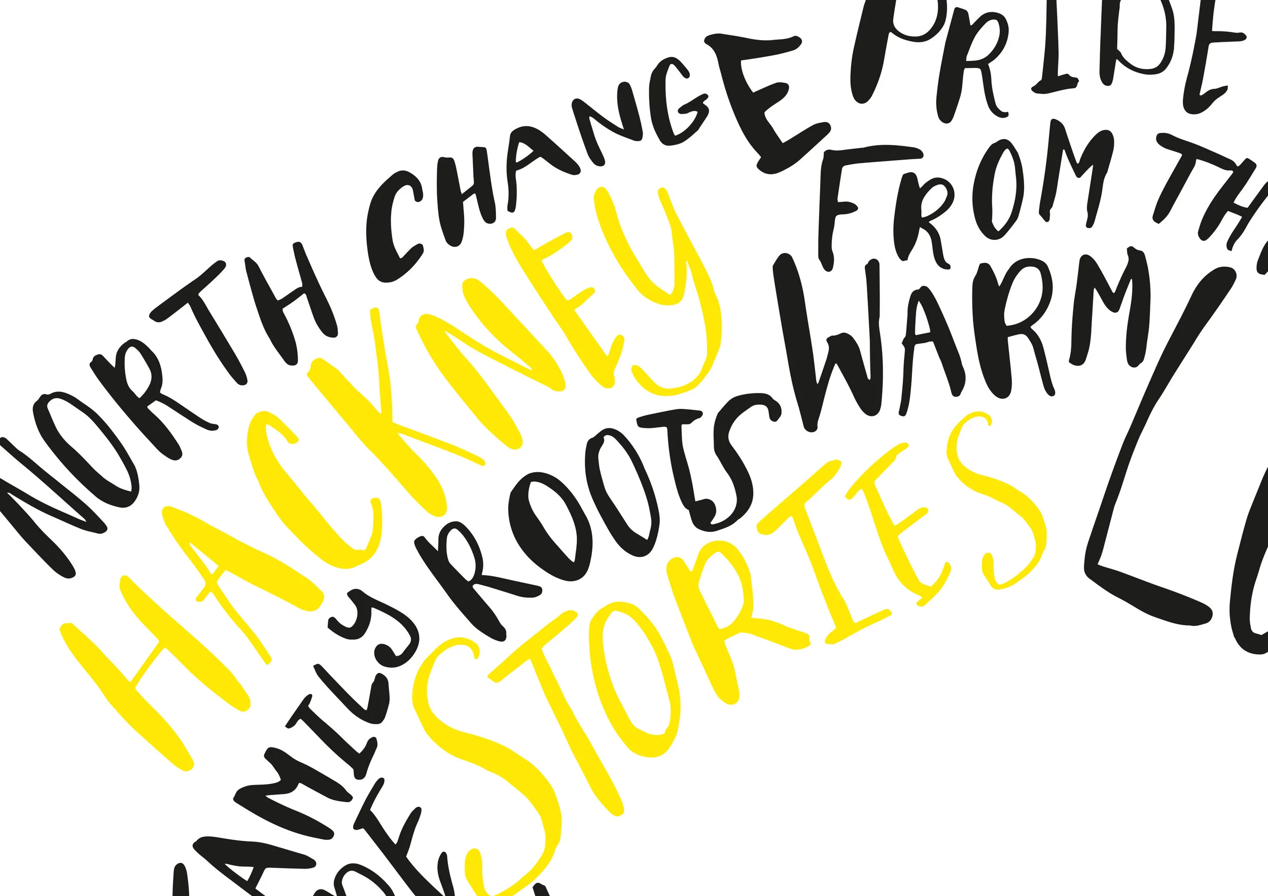
The London Borough of Hackney was at the centre of this typesetting brief, and we were given the task of bringing an ordinary, normally mundane, corporate report, a more contemporary and exciting transformation. For me, East London has always had a community feel, with stories to tell, and I wanted to bring this into my design. I also wanted to incorporate a sense of heart and life at the centre of the design, choosing a cut out circle as part of the design for the front cover. I went on to hand draw, emotive words that were pulled out from the text content provided in the report. These would also form a main part of the design, a nod to the street art of Hackney, as well as a hand crafted, from the heart feel. A bright yellow was then chosen as the main colour in the design, to reflect Hackney's positive and hopeful future.